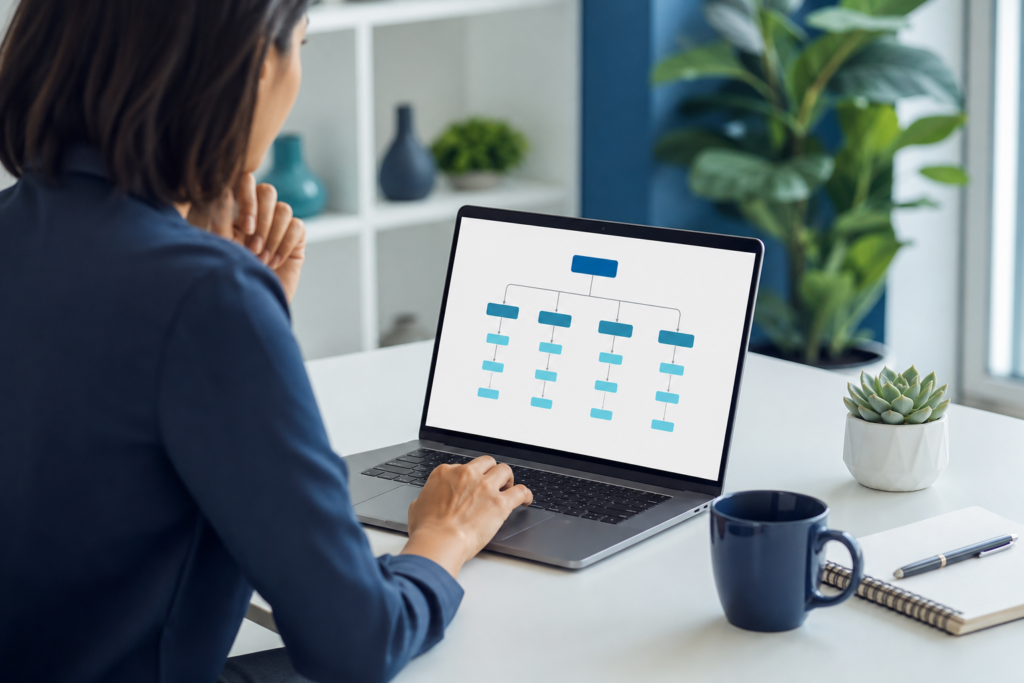
Good website navigation design helps visitors find what they need quickly, understand what your business offers, and take the next step with confidence. For small businesses, navigation is not just a design detail. It shapes the first impression, affects usability on mobile and desktop, and can influence whether a visitor becomes a lead or leaves.
This guide explains how to build a clear, practical navigation system for a small business website. You will learn how to organize pages, write menu labels, design for mobile users, support conversions, and avoid common mistakes that make websites harder to use.
At OneCode Pulse, we often see that strong navigation comes from understanding the business first: what the customer is looking for, what action matters most, and how the site should guide people from interest to contact. That is why navigation should be planned alongside structure, content, and design.
What website navigation design means for small businesses
Website navigation design is the way your site is organized and labeled so people can move from one page to another without confusion. It includes the top menu, footer links, buttons, dropdowns, internal links, and mobile menu behavior.
For small businesses, the goal is usually simple: help people reach important pages fast. Those pages often include services, about information, contact details, pricing, portfolio, booking, and FAQs. If visitors cannot locate these pages easily, they may assume the business is unclear or hard to work with.
A good navigation system should answer three questions quickly:
- What does this business do?
- How do I find the information I need?
- What should I do next?
Start with a simple website structure
Before choosing menu labels or visual styles, define the structure of the site. Many small business websites become cluttered because every page is treated equally. In practice, most websites need a few primary pages and several supporting pages.
A useful structure usually follows a simple hierarchy:
- Core pages such as Home, About, Services, and Contact.
- Supporting pages such as individual service pages, case studies, testimonials, or location pages.
- Informational pages such as blog posts, FAQs, policy pages, or resources.
Keep the structure focused on what users actually need. If your business offers several services, do not hide them all under one vague “Solutions” label unless that term is already familiar to your audience. Clarity is usually better than cleverness.
If you are planning a new website or redesign, it can help to review a broader build strategy through website and e-commerce development services so the navigation supports the entire user journey rather than just the homepage.
Choose menu labels people understand immediately
The best labels are obvious. Visitors should not need to guess what “Capabilities,” “Offerings,” or “Experience” means. For a small business, straightforward language often performs better because it reduces mental effort.
Good label principles
- Use the words your customers would use.
- Keep labels short and specific.
- Avoid internal jargon and branded terms unless they are widely understood.
- Make labels consistent across the site.
For example, if you provide cleaning services, menu items like “Services,” “Commercial Cleaning,” “Residential Cleaning,” and “Contact” are easier to understand than highly creative wording. If you sell products, “Shop,” “Categories,” “Cart,” and “Support” are usually clearer than abstract alternatives.
When you want a menu label to do double duty, pair it with page content that reinforces the meaning. A label such as “Services” should lead to a page that immediately explains what is included, who it is for, and how to get started.
Limit the top navigation to the most important paths
One of the most common small business mistakes is putting too many items in the main menu. A crowded menu forces visitors to scan too much, which slows decision-making and weakens the user experience.
As a general rule, your top navigation should prioritize the few pages that matter most. That often includes:
- Home
- About
- Services or Products
- Blog or Resources
- Contact
If your business needs more detail, use dropdowns carefully. Dropdowns can help when there are multiple service categories, but they should still be easy to scan and should not contain too many choices. Group related pages together in a logical way.
Navigation should reduce choice overload, not add to it. If a visitor has to think too hard about where to click, the structure is probably too complex.
Design for mobile navigation first, not last
Many small business visitors will browse on a phone, so mobile navigation must be easy to tap, read, and close. A desktop menu that looks fine on a large screen can become frustrating on a smaller one if it is not adapted carefully.
Mobile navigation works best when it is simple and predictable. Keep these points in mind:
- Use a clear hamburger menu or compact mobile menu pattern.
- Make tap targets large enough to select easily.
- Keep labels short so they fit on smaller screens.
- Place contact or call actions where users can find them quickly.
- Avoid deep, nested menus that require too many taps.
Mobile users often want quick access to a phone number, service page, directions, or booking form. If those actions are buried, your website may lose high-intent visitors. A responsive layout is also important because navigation should adapt cleanly across screen sizes, and you can review broader responsive design best practices to understand how menu behavior and layout changes work together.
Use internal links to guide users through the site
Top navigation is only one part of good website navigation design. Internal links inside page content also help visitors discover related information, move deeper into the site, and understand your services better.
For small businesses, internal linking can be especially useful on service pages and blog posts. A page about one service can link to another related service, a pricing page, or a contact page. This creates a smoother path for users and helps search engines understand site relationships.
For example, if you have content about improving conversion paths, linking to conversion-focused web design for small businesses can help readers explore the next step after understanding navigation basics.
Use links naturally and only when they genuinely help the reader. Avoid turning every paragraph into a list of links. The goal is to create helpful pathways, not distract from the main message.
Make the contact path obvious
Small business websites often exist to generate inquiries, calls, bookings, quote requests, or store visits. That means your navigation should make the contact path easy to spot from the beginning.
Here are practical ways to do that:
- Include a clear “Contact” or “Get in Touch” item in the main menu.
- Use a visible button for the main action if appropriate.
- Repeat contact details in the header or footer.
- Keep forms and booking pages easy to access within one or two clicks.
If your business depends on local leads, don’t bury your phone number or location details. Navigation should support quick decision-making, especially for visitors who are comparing options and want immediate reassurance.
It is also useful to think about the overall pages your site needs, and a resource like 15 essential features every small business website needs can help you confirm whether your site structure includes the core elements users expect.
Match navigation to business goals and user intent
Not every small business needs the same menu. A service business, a local shop, a consultant, and a nonprofit all have different goals. Strong navigation reflects those differences.
Ask these questions before finalizing the menu:
- What are the top three tasks visitors need to complete?
- Which pages support trust and credibility?
- Which pages help a visitor understand pricing or fit?
- What action matters most to the business?
For example, a consultant may need “Services,” “Case Studies,” and “Book a Call,” while a local store may prioritize “Products,” “Location,” “Hours,” and “Contact.” A good navigation system aligns with user intent instead of copying another business’s menu structure.
Keep footer navigation useful, not repetitive noise
The footer is often overlooked, but it can support navigation well when used intentionally. Footer links are useful for secondary pages, policy pages, repeated contact details, and quick access to important content that doesn’t belong in the top menu.
A practical footer often includes:
- Contact details
- About page
- Service pages
- Privacy policy and terms
- Social links if relevant
Do not duplicate every top-level item just for the sake of repetition. Instead, use the footer to support visitors who have scrolled to the bottom and still need another way to move around the site.
Test navigation with real users and real tasks
Good navigation is not based on assumptions. It should be tested by asking whether real people can find what they need without help. Even a basic review can reveal issues that are easy to miss when you are too familiar with your own website.
Try simple tests such as:
- Can a new visitor find the main service page in one or two clicks?
- Can someone on mobile reach the contact page easily?
- Are menu labels understood without explanation?
- Do users know what to do next after reading a page?
Look for signs of confusion: repeated clicking, backtracking, or users asking where information is located. These are clues that the menu structure, labels, or page hierarchy need improvement.
Common website navigation mistakes small businesses should avoid
Many navigation problems are simple to fix once identified. The key is knowing what to watch for.
| Mistake | Why it causes problems | Better approach |
|---|---|---|
| Too many menu items | Increases scanning time and confusion | Keep only the most important top-level pages |
| Vague labels | Users do not know what to expect | Use clear, familiar wording |
| Hidden contact information | Makes inquiries harder | Place contact paths in the header, menu, and footer |
| Poor mobile menu design | Creates friction on phones | Use a simple, tap-friendly mobile menu |
| No internal links | Limits exploration and page flow | Link related pages within useful content |
A practical framework for better navigation
If you are improving an existing small business site, start with this simple framework:
- List the pages visitors need most.
- Group related pages into logical categories.
- Rewrite menu labels in plain language.
- Check the mobile menu and tap experience.
- Add internal links to guide users to next-step pages.
- Make contact actions visible on every major page.
- Test the menu with a few real tasks and adjust based on friction.
This process keeps the website user-friendly while also supporting business goals. The best navigation feels almost invisible because it helps visitors move naturally through the site without confusion.
If you are also planning broader improvements such as design structure, lead flow, or content layout, it may help to explore how navigation fits within a broader conversion strategy, especially if you want the site to work harder for inquiries and sales.
Conclusion: website navigation design
Strong website navigation design helps small businesses make websites easier to use, easier to trust, and easier to convert. When visitors can quickly understand your pages, move through the site with confidence, and find the next step without friction, your website becomes more effective for both users and your business goals.
Start with clear labels, a simple structure, mobile-friendly behavior, and useful internal links. Then test the experience with real tasks and refine it over time. If you want help improving your site structure or rebuilding navigation around your goals, OneCode Pulse can help you plan a practical solution that fits your business.
Frequently Asked Questions
How many items should a small business website menu have?
Most small business websites work best with a short menu that highlights the main pages visitors need most. A compact structure is usually easier to scan and use than a long menu with many similar options.
Should every page be in the top navigation?
No. Only the most important pages should appear in the top menu. Supporting pages can be linked from service pages, the footer, or internal content so the navigation stays simple.
What is the best way to label menu items?
Use clear words your customers already understand. Labels like Services, About, Blog, and Contact are usually easier to use than creative or vague terms.
Why is mobile navigation so important for small businesses?
Many visitors browse on phones, so the menu must be easy to tap and understand on small screens. A poor mobile menu can create friction and cause people to leave before contacting you.
How can internal links improve website navigation?
Internal links help visitors move between related pages, discover more information, and reach important actions faster. They also support a clearer site structure overall.
Need help improving your website navigation?
OneCode Pulse can help you organize your site structure, simplify menus, and create a clearer path for visitors. Contact us for a free consultation and let’s build navigation that works for your business.