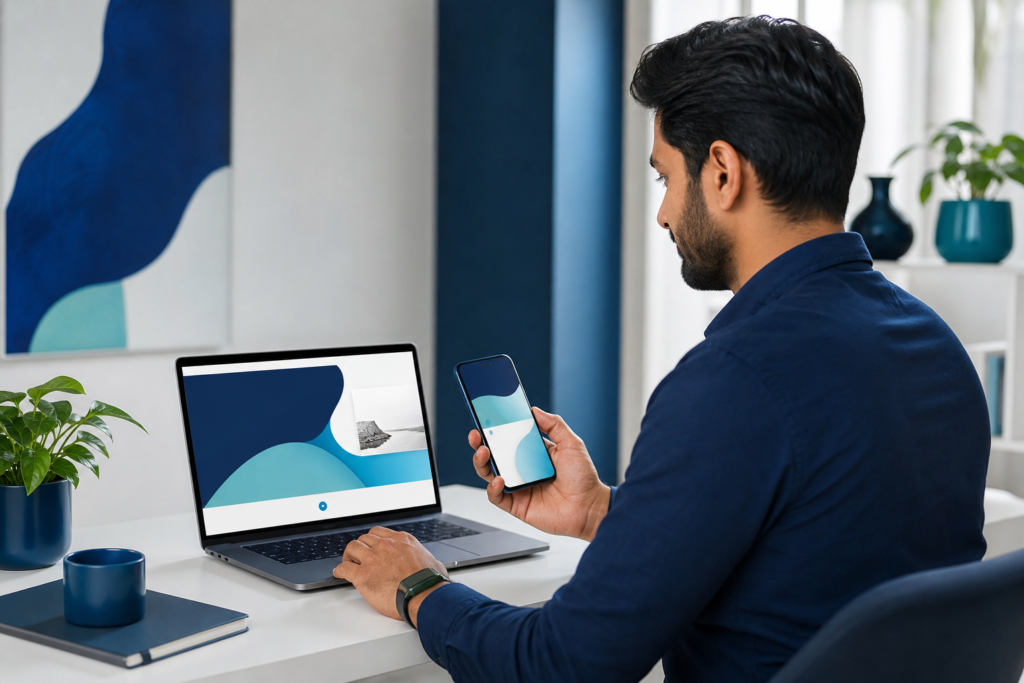
For many companies, the website is the first place customers compare services, check credibility, and decide whether to take the next step. That is why mobile-first design matters so much for small businesses. If your site is easy to use on a phone, fast to load, and simple to navigate, it can support more inquiries, more sales, and more repeat visits.
Mobile-first design does not mean making a website “look good on a phone” after everything else is finished. It means designing for the smallest screen first, then expanding the experience for tablets and desktops. For small businesses, that approach can reduce friction and make the customer journey clearer from the start.
OneCode Pulse helps businesses build websites and digital systems with growth in mind. In practice, that means designing around the real behaviors of your customers: how they search, what they need quickly, and what makes them convert. If you are planning a new site or improving an existing one, a mobile-first approach is one of the most practical ways to get better results from the traffic you already have.
Why mobile-first design matters for small business growth
Small businesses usually do not have unlimited traffic, so every visitor matters. When a mobile visitor has to pinch, zoom, wait, or hunt for information, you lose opportunities. A mobile-first layout helps you focus on the essentials: what the customer wants, what action they should take, and how quickly they can do it.
It also helps your brand feel more professional. A clear mobile experience often signals that the business is organized, trustworthy, and ready to help. That impression can be especially important for service businesses, local businesses, and online stores where customers make quick decisions.
Google’s emphasis on mobile usability also makes this approach a smart foundation for your broader SEO and digital visibility strategy. While content and backlinks still matter, a site that performs poorly on mobile can struggle to convert the traffic it earns.
Start with the customer journey, not the desktop layout
Many websites are built by shrinking a desktop design down to fit a phone. That often creates cluttered pages, hidden key actions, and long scrolls that do not reflect how people actually browse.
A better method is to ask a few simple questions:
- What is the main task a mobile visitor wants to complete?
- Which information must appear immediately?
- What can be removed, delayed, or simplified?
- What action should be easiest to take on a small screen?
For example, a local service business may need the phone number, service area, and booking option visible near the top. An online store may need product categories, search, and checkout to be easy to reach with one hand. A consultant or agency may need clear service summaries and a short contact form.
Keep the mobile experience focused and lightweight
Mobile users often have less patience for decorative elements that do not help them decide or act. That does not mean the site should feel plain. It means every component should earn its place.
Use concise content blocks
Short paragraphs, direct headings, and scannable lists work well on smaller screens. Break complex topics into smaller sections so visitors can move through the page without feeling overwhelmed.
Prioritize the most important calls to action
Each page should have one primary action, such as request a quote, book a call, or buy now. Too many competing buttons can weaken conversions. Make the main action easy to spot, and repeat it where it makes sense without creating clutter.
Reduce visual and technical weight
Large images, unnecessary scripts, and heavy pop-ups can slow the mobile experience. A faster site is generally easier to use and less frustrating for visitors. For small businesses, that can make a direct difference in bounce rates and engagement.
If you are evaluating whether your current site is holding you back, a tool like the Pulse Website Analyzer can help you spot common performance and usability issues before you invest in a redesign.
Design navigation for thumbs, not just desktops
Navigation is one of the biggest reasons mobile users leave a site. If menus are buried, labels are unclear, or subpages are too deep, visitors may never find the information they need.
For small businesses, navigation should usually do three things well: guide visitors to core services, make contact or purchase easy, and reduce decision fatigue.
- Limit top-level menu items to the most important pages.
- Use clear labels instead of clever wording.
- Keep tap targets large enough to press comfortably.
- Make contact details easy to find from any page.
When you are unsure whether your menu structure is helping or hurting, reviewing your site structure alongside website and e-commerce development planning can help you align navigation with business goals instead of page count.
Make speed part of the design process
Speed is not only a technical concern; it is part of the user experience. On mobile, users may be on slower connections or switching between apps while browsing. A slow page can make even a strong offer feel difficult to trust.
There are several practical ways small businesses can improve mobile speed:
- Compress images before uploading them.
- Avoid using oversized files for simple visuals.
- Remove plugins or scripts that do not support a clear business goal.
- Use fewer large animations on key landing pages.
- Test pages on real mobile devices, not just desktop previews.
If your website depends on images for product, portfolio, or service presentation, even small optimization steps can improve the experience. Keeping files streamlined is often easier than rebuilding the site later.
Build pages that answer questions quickly
Small business websites often succeed when they reduce uncertainty. Visitors want to know what you do, who you serve, how much effort is involved, and how to get started. Mobile-first design supports this by forcing pages to be more direct.
A good service page might follow a simple structure:
- State the service clearly.
- Explain who it is for.
- Describe the value in plain language.
- Show the next step.
This structure works well because it respects the way mobile visitors scan. It also helps small businesses avoid long, vague pages that sound polished but fail to convert.
If you want a deeper framework for planning layouts, content hierarchy, and user experience, the mobile-first design practical guide offers a useful next step for shaping a better site experience.
Use content that is easy to read on small screens
Readability is often overlooked, yet it strongly affects whether visitors stay on a page. On mobile, good typography and spacing can make a site feel easy and professional, while poor formatting can create instant friction.
Focus on these basics:
- Choose readable font sizes without forcing zoom.
- Use enough line spacing for comfort.
- Keep paragraph lengths short.
- Avoid dense walls of text.
- Use headings to break content into clear sections.
Readable content is not just a design preference. It helps customers understand your offer faster, which is especially valuable for service-based small businesses where clarity often drives the next inquiry.
Make forms simple and conversion-friendly
Forms are one of the most important mobile touchpoints. If your form feels long, awkward, or difficult to complete on a phone, many visitors will abandon it before finishing.
For small businesses, form design should be intentionally minimal. Ask only for the information you truly need at the first step. If you need more details, collect them later in the process.
Useful mobile form practices include:
- Using short labels and clear field instructions.
- Keeping the number of fields as low as possible.
- Choosing the right input type for phone numbers, emails, and dates.
- Showing clear error messages near the relevant field.
- Placing the submit button where it is easy to reach.
This is often one of the fastest ways to improve conversion performance without changing your offer.
Connect mobile-first design with broader business systems
For many small businesses, a website is only one part of the customer journey. Leads may need follow-up, orders may need processing, and customer data may need to move into other systems. Mobile-first design becomes more valuable when it fits into that larger workflow.
For example, a mobile visitor who submits a form should reach the next step without delay. A booking or inquiry should be easy to route to the right team. A store checkout should feel smooth from product page to confirmation. This is where design, operations, and automation start to support one another.
OneCode Pulse builds connected digital solutions that include websites, applications, and systems designed for real business use. If your growth depends on better follow-up, smoother workflows, or more organized customer handling, exploring ERP and CRM business systems may help you connect your front-end experience with the back office.
How to know whether your mobile design is working
You do not need perfect analytics to spot early signs of improvement. Start by looking for simple indicators:
- Are mobile visitors reaching important pages?
- Do they stay long enough to read key content?
- Are contact forms, calls, or purchases increasing?
- Are users dropping off on specific pages or steps?
Even without advanced reporting, customer feedback can reveal problems quickly. If people ask the same questions repeatedly, miss obvious details, or struggle to complete actions on their phones, the design may need refinement.
That is why mobile-first work should be treated as an ongoing improvement process rather than a one-time visual update.
Common mobile-first mistakes small businesses should avoid
Some issues appear small but create major friction on mobile. Avoiding them can significantly improve usability.
- Hiding contact details too far down the page.
- Using overly complex menus with too many choices.
- Letting images or videos slow the page too much.
- Writing long, unbroken paragraphs.
- Forcing users through unnecessary form fields.
The goal is not to simplify your business message until it is vague. The goal is to present your value clearly enough that visitors can act without confusion.
Practical next steps for small businesses
If you want to use mobile-first design to grow faster, start with the pages that matter most: home, service pages, product pages, and contact or checkout flows. Improve those areas first before worrying about less important pages.
A simple improvement plan might look like this:
- Review your site on a real phone.
- List the top three friction points.
- Cut or simplify anything that distracts from the main action.
- Improve speed, readability, and navigation.
- Test the new version with real users or customers.
For businesses that want guidance beyond a basic redesign, the right partner can help connect design decisions to measurable business needs. OneCode Pulse focuses on practical digital solutions that support growth, from websites and marketing to automation and connected systems.
Related resources
Conclusion: mobile-first design
For small businesses, mobile-first design is one of the most practical ways to improve usability, reduce friction, and support growth. When your site loads faster, reads clearly, and guides visitors toward the right action, you make it easier for mobile users to become customers. Start with the pages that matter most, simplify the journey, and keep improving based on how people actually use your site.
Frequently Asked Questions
What does mobile-first design mean for a small business website?
It means designing the website for mobile screens first, then expanding the layout for larger devices. The goal is to make the most important content and actions easy to access on a phone.
Is mobile-first design the same as responsive design?
Not exactly. Responsive design adapts a site to different screen sizes, while mobile-first design starts with mobile priorities during planning and layout decisions.
Which pages should small businesses improve first?
Start with the home page, service or product pages, and the contact or checkout flow. These pages usually have the biggest impact on enquiries and sales.
How can I tell if my mobile site is hurting conversions?
Look for signs like high bounce rates, low form completions, repeated customer questions, or visitors leaving before reaching key pages or actions.
Do small businesses need a full redesign to benefit from mobile-first design?
Not always. Sometimes the biggest gains come from simplifying navigation, improving page speed, shortening forms, and restructuring the most important pages.
Ready to improve your mobile website experience?
If you want a clearer, faster, and more effective mobile-first website, OneCode Pulse can help. Book a free consultation to review your current site and identify practical improvements that support growth.