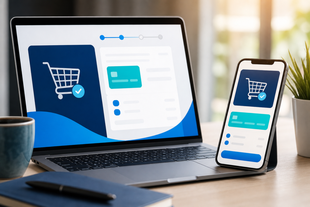
For growing brands, e-commerce checkout optimization is often the difference between a completed sale and an abandoned cart. A product page can create interest, but the checkout is where intent turns into revenue. If that path feels slow, confusing, or untrustworthy, shoppers leave before paying.
A practical guide to e-commerce checkout optimization
This article breaks down 10 common checkout mistakes growing brands should avoid, along with practical ways to fix them. The goal is simple: reduce friction, make buying easier, and help more visitors complete their orders with confidence.
Checkout issues are not always dramatic. Sometimes the problem is a small delay, an unnecessary form field, or a missing payment method. But these small problems compound quickly, especially on mobile devices or during high-traffic campaigns. That is why e-commerce checkout optimization should be treated as an ongoing part of store improvement, not a one-time project.
1. Forcing visitors to create an account before buying
One of the most common checkout mistakes is requiring account creation before purchase. Many shoppers are ready to buy, but they do not want another password to remember or another profile to complete. If account creation comes first, some will abandon the cart immediately.
How to fix it
- Offer guest checkout as the default or clearly visible option.
- Let customers create an account after purchase, when the transaction is already complete.
- Keep account benefits simple, such as order tracking or faster repeat checkout.
If you want a deeper framework for improving the full purchase flow, our e-commerce checkout optimization for growing brands guide covers the process from diagnosis to implementation.
2. Asking for too much information too early
Every extra field increases effort. When a checkout form asks for unnecessary details, shoppers feel the process is longer than it needs to be. That is especially true on mobile, where typing is more disruptive.
How to fix it
- Remove any field that is not required to complete the order.
- Use smart defaults and auto-fill where possible.
- Split long forms into clear steps only if the steps are truly helping usability.
A good rule is to collect only what you need now and defer everything else until after purchase or fulfillment.
3. Hiding shipping costs too late
Unexpected costs are one of the fastest ways to lose trust at checkout. If shipping fees appear only at the final step, customers may feel misled or assume the offer is less competitive than it looked at first.
How to fix it
- Show estimated shipping as early as possible.
- Provide a shipping calculator or visible delivery range.
- Be clear about taxes, duties, and any additional fees before payment.
Transparency matters. The more predictable the final price is, the less likely shoppers are to pause or back out.
4. Limiting payment methods
Customers do not all want to pay the same way. If your checkout offers only one or two payment methods, you may be excluding people who prefer digital wallets, local payment options, or card alternatives.
How to fix it
- Add the payment methods your audience actually uses.
- Prioritize mobile-friendly and fast payment options.
- Make payment choices visible without adding clutter.
For brands building a broader commerce stack, our website and e-commerce development services can help align checkout functionality with the rest of the store experience.
5. Making the checkout process too long or unclear
When shoppers cannot tell how many steps remain, the process can feel endless. Long checkouts create uncertainty, while unclear progress creates hesitation. Both increase the risk that customers stop before finishing.
How to fix it
- Use a clear progress indicator if the checkout has multiple steps.
- Keep each step focused on a specific task.
- Remove distractions like unnecessary side links or competing calls to action.
If a step exists only because of internal workflow, consider whether it can be simplified without affecting operations.
6. Ignoring mobile checkout experience
Many brands still design checkout mainly from a desktop perspective. But on mobile, small buttons, crowded layouts, and awkward form fields create more frustration. A checkout that works on a laptop can still fail on a phone.
How to fix it
- Test the full checkout flow on different screen sizes.
- Use large tap targets and readable text.
- Reduce typing by enabling auto-fill, address lookup, and numeric keyboards when relevant.
- Keep primary actions easy to spot and easy to tap.
Mobile checkout should feel quick, not cramped. If users have to pinch, zoom, or hunt for buttons, the experience is working against you.
7. Not building enough trust at the final step
Even when shoppers are close to paying, they still want reassurance. If the checkout page looks generic, incomplete, or visually inconsistent with the rest of the site, some users may hesitate. Trust signals matter most when the customer is about to share personal and payment information.
How to fix it
- Keep branding consistent across the store and checkout.
- Display clear security indicators where appropriate.
- Show return, shipping, and support information in a concise, helpful way.
- Make contact details easy to find if a shopper has a question.
For brands also working on retention and follow-up, digital marketing and customer engagement can support trust before and after the purchase, helping buyers feel more confident throughout the journey.
8. Failing to support error prevention and correction
Nothing disrupts checkout like vague errors. If a shopper submits a form and sees an unhelpful message such as “invalid input” without knowing what to do next, the process becomes frustrating. Repeated errors often lead to abandonment.
How to fix it
- Place validation messages close to the field that needs attention.
- Use plain language that explains the problem and how to correct it.
- Preserve entered data so users do not have to start over.
Good checkout UX should help shoppers recover quickly, not punish them for small mistakes.
9. Overcomplicating discounts, coupons, or promotions
Promotions can help conversions, but they can also create friction if the rules are confusing. If customers spend time searching for a coupon field, wondering whether they missed a discount, or trying multiple codes, the purchase flow slows down.
How to fix it
- Keep discount messaging simple and visible.
- Do not let promotions distract from the main payment action.
- Only include coupon fields if they are genuinely useful to your audience.
Promotions should reinforce the decision to buy, not make the customer feel like they need to negotiate before checking out.
10. Treating checkout as a one-time setup instead of a process to improve
Checkout performance changes over time. Customer expectations shift, device behavior changes, payment preferences evolve, and new traffic sources can reveal new friction points. Brands that never review the checkout experience often miss easy fixes.
How to fix it
- Review checkout drop-off points regularly.
- Collect customer feedback when possible.
- Test small improvements instead of waiting for a full redesign.
- Monitor behavior on mobile and desktop separately.
This is where e-commerce checkout optimization becomes a continuous improvement discipline. The best-performing checkout flows are usually not the most complex; they are the clearest, fastest, and easiest to trust.
A simple checklist for growing brands
If you are not sure where to start, use this quick review:
- Can customers buy as guests?
- Are the form fields minimal and necessary?
- Are shipping costs visible early?
- Do you offer the payment methods your audience expects?
- Is the checkout easy to complete on mobile?
- Are trust signals present at the decision point?
- Do errors explain exactly how to fix the problem?
- Is the checkout reviewed regularly, not just launched once?
For teams that want to improve the whole digital buying journey, the contact OneCode Pulse page is a practical next step. A structured review can help identify which issues are causing the most friction and which improvements are likely to matter most.
It is also useful to look at your store as a system, not just a page. Checkout works best when product pages, cart behavior, payment options, and post-purchase communication all support each other.
| Checkout mistake | What it does | Better approach |
|---|---|---|
| Forced account creation | Adds unnecessary friction | Offer guest checkout |
| Too many form fields | Slows completion | Collect only essential information |
| Late shipping costs | Creates price surprise | Show cost estimates early |
| Limited payment options | Excludes some buyers | Support common preferred methods |
| Poor mobile layout | Makes checkout harder to use | Design for small screens first |
Small improvements can have a meaningful effect when they reduce hesitation at the last step. Even if each change seems minor on its own, together they can create a smoother, more reassuring checkout experience.
Conclusion: e-commerce checkout optimization helps protect your sales
Growing brands do not always need a full redesign to improve results. In many cases, the biggest gains come from removing friction, clarifying the process, and making checkout feel safer and easier to complete. Strong e-commerce checkout optimization is about respecting the customer’s time and reducing the reasons they might leave at the final step.
If your checkout has become a barrier instead of a bridge, now is the time to review it carefully and fix the issues that matter most.
Frequently Asked Questions
What is the most common checkout mistake for growing brands?
For many stores, the most common mistake is adding too much friction, such as forced account creation, too many fields, or hidden costs that appear late in the process.
How do I know if my checkout needs improvement?
Look for signs like high cart abandonment, mobile drop-offs, repeated form errors, or customers asking questions about pricing, shipping, or payment options during checkout.
Should every store offer guest checkout?
In most cases, yes. Guest checkout reduces friction for first-time buyers and helps customers complete purchases faster, while account creation can be offered after the order is placed.
Why is mobile checkout so important?
Many shoppers browse and buy on phones, so checkout must be easy to use on smaller screens with clear buttons, readable text, and minimal typing.
Can small checkout changes really improve sales?
Yes. Small fixes such as clearer shipping information, better error messages, and fewer form fields can remove obstacles that prevent customers from finishing their purchase.
Need help improving your checkout flow?
OneCode Pulse can review your store experience, identify checkout friction, and help you plan practical improvements. Reach out for a free consultation and let’s make purchasing easier for your customers.